Darling Pitch
Target Audience:
My target audience is a combination of both males and females, I am not aiming my magazine at single sex because i believe it could be a chance to gain more profit and the content is not particularly biased to either sex. Aged from 16-26 this is because the content of my magazine may contain humour and controversial material that a younger audience would not appreciate.
Profile:
Name: Henry Appleton
Age:22
Class: working/middle
Job: Part-time blogger/Full time student
Interests: Shopping for vinyls because not interested in mainstream music and vintage or statement clothing.
Religion: Not specified
Genre:
The genre of music I decided to go with is a combination of indie rock and indie electronic to which is popular at the moment, less popular than the vast pop or hip hop industry but is currently growing in popularity and is a genre I enjoy. My inspiration for this genre are artists like SBTRKT, Passion Pit, Bombay Bicycle Club and Hozier.
Masthead:
I decided to name my magazine "darling" not directly linked to the music industry like most music magazines but magazines such as "wire" have names that are sharp and odd, to which is one of the reasons i really liked it. It doesnt stick to the normal conventions, to which is something I want to do similarly. My inspiration for the masthead not only came from "wire" magazine but the actual name came from my favourite film, "Kill your darlings" to which is set in the 1940s and has an incredible soundtrack. Such music inspired me to use the title. My audience will enjoy the simplicity and quirky look to the magazine.
Colour Scheme:
The colour scheme I had intended to use were dullish colours unlike most magazines in general which use bright bold colours to attract their audience because I wanted to reach out to a different group of people, because my magazine is not for a mainstream music genre so I do not intend to use the mainstream characteristics. I later decided on a black and white theme.
What Makes Us Different:
Not only is the genre different, but the colour scheme doesnt fit the exact characteristics of others. Inspired by an issue of "wire" darling is going to be different, the title in itself breaks the rules to which my audience i hope will find intriguing. I have not yet seen a magazine to which covers the genre and therefore there is a gap in the market for a magazine of this genre and odd nature.
Ideas:
The main article for darling will be an interview with indie rock artist Hozier to which would be appealing to my target audience because they enjoy this genre of music and would be familiar with the artist. Other articles for the front cover may include; your playlist, underground tracks to look out for and top grossing songs.
Darling Pitch Part 2
This is my original pitch, I made using a powerpoint presentation scheme called Powtoon. I hope you enjoy it.
Letti.Media.Blog.Letti.Media.Blog.
Thursday, 18 December 2014
Tuesday, 9 December 2014
Photo Shoot 1 & 2
Photo Shoot For Darling:

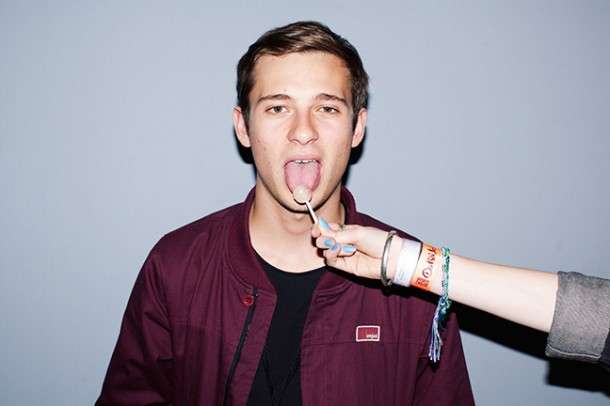
For my photo shoot, I intended to think about the composition of the shot. Instead of having my models in the centre of the shot I decided instead to have them to the right of it. The background in my shots are stairs. I chose this background because they are bright and arty. The odd background will intrigue me audience, it shows that this magazine is the climbing to success.


The simple costume for each model is because my audience enjoys simplistic looks. The background is bold and and attention grabbing so I decided to go with a simplistic costume design so the two wouldn't clash. The female model had previously joined me to a vintage thrift store known to the public as, The East End Thrift Store where we acquired the suede bomber jacket she is seen wearing, to which is appealing because my audience enjoys shopping at local thrift stores. The male models jumper is from Penguin a widely known store to which would also be found appealing because individuality is key to the fashion my audience follows.
I did not choose to have my models preform in any
spectacular manor for the shoot because indie rock magazines such as the Wire do not have their models doing anything particularly different. So I ensured that my models gave simple poses, some more simplistic than others as seen with my female model.
 I also decided to not use make up with my female model as usually expected because as seen on a previous cover of Wire (shown on my blog) presents a model without make-up or with very little to which I found refreshing because I want my magazine to be inspiring to an extent. I want to portray a positive on young women that make-up is not needed to allow someone to be attractive.
The image I chose is the one present at the bottom of my array of photos, I chose this photo because it presents my model as confident through the eye contact with the camera, thus the audience, which gives it a welcoming feel to read the magazine. Almost as if he was inviting you to come and read it. On the other hand it didn't want to portray him as too confident because that could be mistaken as cockiness which isn't attractive. I wanted to show a shy, sensitive side to my model, thus showing the magazine as something that can be comforting and yet still fun. Thus the hand covering part of his face, showing he almost hiding, inviting the reader to find out why.
 I also decided that because my model is racially cultured that this wouldn't exclude anyone from reading the magazine. The focus also puts emphasis towards my model which was to ensure that he was the main focus of the image because the background is quite vibrant to which is not usually the case as most magazines decide to have a low key background and a vibrant model but I wanted to show that my magazine breaks the usual conventions of magazines to an extent because my audience will enjoy the individuality of it and will also enjoy the quirky nature of it.
 Second Photo Shoot:

It came to my attention that I wasn't fully satisfied with my efforts in my original photo shoot, so a further photo shoot was completed in order to fix the indiscretions that I found. The setting was not completely to my liking so I decided to base my photo shoot in a range of different settings and include more adventurous poses. Here is a selected few:


Letti.Media.Blog.
Thursday, 13 November 2014
T.A.P
T.A.P

Age: 16-24
Gender: F/M
Ethnicity: N/A
Religion: N/A
Social Class: Working/Middle Class
Jobs: Interior Designer/Retail/Stylists/Student/Bloggers
Income: (Above) Average
Location: London/ East London: Shoreditch/Victoria Park Rd/London Fields.
Brands: Stussy/ Lazy Oaf/ Urban Outfitters/ Topshop/ Topman/
Zara/ Henry Holland/ Kanken/ Pins & Needles/ Sparkle & Fade
Technology: Apple Products: iphones/ iPads/ MacBooks/ FujiFilm Instax/ Poloroid
Fashion: Statement clothing: Combination of basic and weird, outstanding clothes. 80's and 90's fashion is also popular within this group. Independent clothing companies.
Hobbies: Enjoy photography,shopping in vintage stores such as: East End Thrift Store, Retro Metro and Crystal Palace Vintage. Also enjoys spending time in London Fields and Victoria Park; going to indie coffee shops and spending time on their blog.
Darling Pitch:
http://www.powtoon.com/show/fMhipqtqMBb/darling-pitch/
Letti.Media.Blog.
Wednesday, 12 November 2014
Why Do You Read Music Magazines?
Why Do You Read Music Magazines?
In our current generation it is has become increasingly more unlikely to see young people reading magazines because of the growing development in technology, not only has it effected our literature, ibooks, but now it is attacking magazines. Unlike the majority, I still enjoy flicking through the pages of a magazine. I appreciate the hard work gone into creating a magazine, the decisions as to what is going to make it to this months cut. I am guilty of picking up magazines, reading a few articles and putting it back. My favourite to which is not common, are big lengthy articles because i enjoy reading and I can appreciate the time put into it, immersing myself in the pages and into the minds of the writer but regardless of my opinions I need to why others like to read music magazines.
Do you read music magazines?
I dont really read music magazines because I dont usually read magazines in general but I have seen some and do think they look quite interesting.
I read music magazines quite often a favourite of mine being Fader because its an indie hip-hop magazine and is very fashion related to things which I love. Its really out there and different and i guess thats why I can appreciate it so much.
Why do you read music magazines?
As stated before I dont tend to read music magazines.
Why?
Well, Im not that interested in music so it doesnt appeal to me on that level but I have seen some that I would consider reading because they look more like fashion magaines. Really arty and fun.
I read them because Im in love with the idea that I can pick up a magazine and get to know a band or an artist through an interview so well that I begin to feel like I know them which is quite incredible. Also recently I've noticed how music magazines have almost become fashion magazines, of course you can tell its a music magazine from the contents of it, but most covers now look so funky that you might mistake it for a fashion magazine.
What is your favourite part of a music magazine?
Considering that I've never sat down to read one, the thing I like the most, as said before, is the really arty cover. I think they're so funky and cool.
My favourite part of a music magazine is the really long essay like interviews, you find especially in wire, because as previously stated I love that you get to know the interviewee so well. I think its wonderful we can feel that close with an artist.
Letti.Media.Blog.
Friday, 7 November 2014
Sub-Genre of Music Magazine.
Sub-Genre of Music Magazine.

 The sub genre of music I wish to use in my magazine is Indie Rock/Electronic because I enjoy listening to this particular genre; artists would include Bombay Bicycle Club, Passion Pit, Bloc Party, Foals, Flume and Kodaline. This is a less popular genre than Hip-hop or pop but still serves a fan base, being less popular and less known has its challenges but I believe that once shown through my magazine what an interesting and fun genre it is, its fan base will soon increase. All is needed is publicity to which my magazine will bring.
Magazines that cater with such a genre include, The Wire, who do not directly cater for this particular genre but cater for independent groups, Clash and Flux. As you can see below they all have a very basic colour scheme and and the font is very basic because Indie music is simple and doesn't need thrills to make it interesting unlike pop music. The simplicity is attractive to their audience because indie music is simple.

The Wire magazine uses a light pallet for its colour scheme; light shades of blue and white, with simplistic font, to which really represents how indie music doesn't need dressing up like hip-hop or pop music where the covers use bright colours and bold, eccentric font treating their audience like magpies. Attempting to entice them with colours where as the Wire doesn't need to, breaking away from the usual characteristics of music magazine, with little writing on the cover because it more focused on the photography of the image. XLR8R is a real example of rebelling against the conventions of a music magazine with just a few lines of text and the masthead, you are forced to look at the main image, to which is edgy and quite intimidating. This is because XLR8R focuses mainly on electronic music to which is why the front cover is so edgy because electronic is so fast pace and like the cover break a lot of rules. Under The Radar, out of the three, sticks most to the conventions of a music magazine, the main image is quirky and somewhat fun. It links to the main article quote, "Wasted On The Youth" as the main image shows an infant child.
Letti.Media.Blog.
Tuesday, 4 November 2014
Music Magazines and Conventions.
Research Music Magazines And Conventions.
 The Wire is a British music magazine founded in 1982, initially concentrating on contemporary Jazz has branched out and has recently covered hip-hop, modern classical, free improvisation, post rock and various forms of electronic music. Not sticking to the usual characteristics of other music magazines, for example where most music magazines would have little writing and more photography The Wire confronts their audience with near essay long interviews and articles. The font for their magazine is bold and simple, the colour scheme is a combination of dark and light, with deep shades of grey and with black and white. The contrast in colour is unusual compared to most magazines to which have brighter colours this is because they're magazine is aimed a more mature audience, to which would appreciate the simplicity of the magazine.
Letti.Media.Blog.
The Magazine: The Masthead and Magazine Front Cover and Contents Page.
The Magazine: The Masthead.
In class today we were deciding on a font for our masthead in our magazine and so we were asked to draw up three designs for the font i went for three quite different fonts that i thought would represent the school in different ways. The first, being quite light and curly showing the school being a place of enjoyment and welcoming to students. The second is the contrast to that, its bold but still playful, implying that the school is not a playground but a place to learn yet still somewhere you can have fun. The last being bold, yet contrasting at the same time but all illustrate that school is a place of enjoyment rather than a prison.


Finally: My Magazine Front Cover and Contents Page.


My target audience is made up of both genders, but particularly females aged 15-18 because between those ages you are either preparing for exams or are sitting exmas. As to why my magazine is partially more for the female gender is because of the colour scheme pastel colous are in fashion at the moment and thus it is more likely for it to seem appealing to a younger female audience.
As you can see the main image of the girl laying on the floor represents how stressful exam season is to which is emphasised by the books lying on her to show that studying is tiring and exhausting. This is then further emphasised by the cover line, "Studying getting you down?" a pun at the photo because the girl is physically down on the floor. The photo i decided to edit with a blue fliter because I thought it would fit with the colour scheme.
The colour scheme i decided to go with was a mixture of pastel colours which would be found attractive to a young audience because pastel shades are very in fashion at the moment. There is a strong contrast between blue and pink because i want my magazine to not exclude genders.
The Masthead is made of very bold, flirty writing because i want it to be engaging with the audience. The colour is a pastel blue to continue my colour scheme.
For the contents page the colour scheme continues with the same filter on the photo. The photo is of another girl looking into the distance, I used a long mid-shot to take the photo because her clothing was quite dark and a long shot would be two distracting on the background.
Letti.Media.Blog.
Letti.Media.Blog.
Wednesday, 1 October 2014
Next Post: Magazine Preview
Next Post: Magazine Preview
It's been a while since I last posted but in class we have been up to a lot. Here is a little catchup: I learned how to photoshop and not to blow my own horn but I'm pretty good, even if I do say so myself. We began to plan for our school magazine cover, we drew a preview of the photos we wanted to take and then went out and took some photos. So last year I didn't put much effort into my lessons in Media, it was a big change for me, I had recently moved house and school and so when I joined my new school I was put in Media which wasn't one of my options in my previous school and so I had a lot to catch up on to which I wasn't to pleased about because of this I didn't put much effort into my coursework and revision. Still known as the underachiever I am determined to work harder not only in media but in all my subjects. I am going to ace this year!!
Letti.Media.Blog.
Wednesday, 17 September 2014
My Favourite Pieces Of Media
My Favourite Pieces Of Media
I was asked to name my favourite pieces of media today and I wasnt quite sure how to answer. How do you define a piece of media? Well, looking back on the question its simple. Media helps shape how we live on a day to day basis, whether it is social networking, e.g Facebook and Twitter, the news, e.g Newspapers/Television/Magazines, video games, films and television shows.
At #3 is the Metro Newspaper. A free tabloid newspaper which is distributed from Monday to Friday given by hand in the street but I usually find mine on the bus, the train or the tube. I love reading articles when I'm bored or just when I'm having a bad day it really cheers me up. I think the Metro newspaper is a brilliant concept because of its accessibility and the fact that it is free which meaning everyone can be up to date with the news.


At #2 is a group of people who create sketches on a YouTube channel, called CollegeHumor. They make parodies, sketches and other crazy, off-the-wall, comedy, creations! I have been watching their videos for about two years and they have had me in stitches laughing. I don't have a favourite but one I have watched recently has really caught my eye, called "If Google Was A Guy" it's a 3 part sketch about Google if he was a human man. How he would react to some of the ridiculous things people search. I know that I have searched some odd things in my time as Google has always been my go to if I can't answer question. So it's funny to see how "Google" reacts to us.
Finally we have got to #1 and my favourite piece of media has to be the wonderful and vast social media! To be specific Facebook. I love how simple it is to get in contact with people who in everyday life I would not be able to communicate with. I live in London and which is widely populated with people of all sorts of ethnicities which is incredible because of the cultural traditions they bring with them that we are able to embrace but Facebook allows us to get in contact with people all other the world and embrace their culture on a much larger scale. We are able to share our likes and dislikes and have discussions about how we live.
Letti.Media.Blog.
Target Audience Profile: Vogue
Target Audience Profile: Vogue

The target audience is clearly women but what differentiates this magazine to a magazine like Bliss, unlike Bliss which will usually consist of bright colours to attract a less mature audience, this magazine uses suttle yet effective colours. The white background, shows purity and maturity therefore Vogue is for the mature woman. The central image on the cover is Emma Watson, an English actress and model who is best known for her character in Harry Potter but has since been trying to achieve a more serious profile as an actress and has been seen in films such as; My Week With Marylin, Perks Of Being a Wallflower, Noah and is currently filming for a new film which will be out in 2015 called Regression. The fact that Vogue used Emma Watson is because she is high profile and is currently maturing into an artist, just as the target audience are the mature woman. Here is a TAP of a Vogue reader:
Name: Dorophy Apple-Smith
Age: 32
Job: Accountant
Relationship Status: Married
Children: Two.
Religion: Christian, Church of England
Likes: Fashion, Eating out at restaurants with the family, the latest diet and her twitter account.
Last Tweet: "On holiday with Markus and the children. Egypt is beautiful"
Likes To Shop In: Zara, Fat Face and Vintage Shops (on occasion)
Letti.Media.Blog.
Subscribe to:
Comments (Atom)